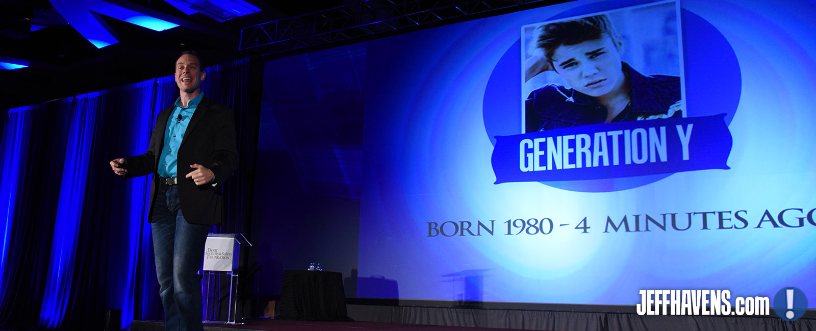
I’ve been a professional keynote speaker now for over a decade, which means I know what I’m saying when I tell you that nobody really wants to look at me while I’m talking. To be fair, it’s not just me – nobody really wants to look at anyone while they’re delivering a presentation, which is why so many conference attendees play with their phones or stare blankly into the distance. Everyone gazes in my general direction, if for no other reason than because it would be weird to swivel around and stare at whoever’s sitting behind them. But in order to make sure they actually pay attention, I’ve augmented my presentations with Powerpoints that capture my audience’s attention enough to keep them focused on what I’m saying instead of trying to conquer whatever stubbornly difficult round of AngryBirds they’re currently struggling with.
Now if you’ve sat through Powerpoint presentations before, you’ll know that they have the potential to be maddeningly, cripplingly tedious. You’ll also know that they have the potential to be an excellent enhancement to what might otherwise feel like a long lecture. So how do you accomplish the latter without falling into the trap of the former?
Here are a few tips:
Don’t Get Overfancy with Your Technology
There’s no audio in any of my presentation, nor video, nor any need for an Internet connection. I don’t use Prezi partially because it’s more difficult to wire in to some A/V set-ups but primarily because it often tempts people to use unnecessarily elaborate sweeping animations just because they can. I’m not saying you shouldn’t exploit whatever technology you have available, but I’m definitely saying I’ve sat through far too many presentations that died for five minutes while the presenter tried to get their un-embedded YouTube video to play. So if you don’t have 100% mastery over the technology you’re using to power your presentation, you shouldn’t be using it.
Build Your Slides Slowly
Let’s say you want to have a slide with a main heading and three bullet points underneath it:
Headline
- Point 1
- Point 2
- Point 3
If you build this as a single slide, you’ll be doing your audience a disservice. By the time you finish discussing Point 1 they’ll be reading Point 3, and it’s very difficult to pay attention to what you’re hearing when it’s different from what someone is saying to you. So if you want them to stay on the same page as you, break this into four slides: Headline, Headline with Point 1, Headline with Points 1 and 2, and Headline with Points 1, 2, and 3. This will force your audience to be where you want them to be, because you won’t be giving them an opportunity to anticipate what you’ll be talking about in a few minutes. Is it more work? Yes, by about five minutes. Trust me, it’s worth the tiny extra effort.
Don’t Give a Printed Version of Your Presentation To Your Audience Ahead of Time
If you want them to have your bullet points at the end of your speech or sales pitch, go right ahead and give them a printout. But if you do it beforehand, your audience is going to skim through what you’ve given them and then assume that they know everything there is to know. They might not intend to do this, but it will happen, which will make it significantly more difficult for you to keep them focused and engaged while you’re talking.
Your Presentation Should Not Duplicate What You’re Going to Say
Here’s what I mean by this. If I could go through your Powerpoint and gain a perfect understanding of your speech, then there’s no reason for me to listen to you talk. Just give me the Powerpoint and save us both some time. Which means your presentation should augment what you’re going to say, not duplicate it. I’ve taken this to such an extreme that my Powerpoints mean virtually nothing at all unless I’m talking. They make sense while I’m presenting, but otherwise they’re semi-nonsense. It might not make sense for you to go that far, but you should make sure that you’re structuring your presentation in such a way that it quickly becomes clear to your audience that they need to be paying attention to what you’re saying or they’re going to miss some critical information.
This should give you a good start. Pretty soon you’ll have your audience eating out of your hand, which is a weird phrase that I’ve chosen to use anyway. Bring a napkin!


Good tips, Jeff. I hate sitting through bullet-pointed slides. Having a just a picture helps the attendee focus on the speakers words, and will have an image to associate with the comments. And, I always plan for a no internet situation. Wifi is terribly unreliable depending on the facility. Best to have everything at the ready on your machine.
Great article mister Jeff!! Totally enjoy reading your stuff.
Thank you Monica!